Glyphs of Time :: a blog by jarvis grant

March 2, 2012

Red Tail Commander: Gen. Benjamin O. Davis Jr.

Lucasfilm's Red Tail Movie Poster

Lucasfilm's Red Tail Movie Poster. ©2011 Lucasfilm

There has been quite a bit of hoopla about the George Lucas movie, Red Tails. Much of the “controversy” is the idea of a white guy telling a black man’s story. The odd thing is that it has taken sixty nine years for somebody to tell the story of the Tuskegee Airmen in a major way. There is so much to recount about these guys, that it will take more than one telling to get it all out in a meaningful way. Actually, there are so many untold stories and myths about World War II and the participation of African Americans that have yet to told. But ya know, there’s something about the heroic romanticism of fighter pilots that is just hard to beat!

When I was a kid in high school, I was really into WWII aviation. I knew all the planes of the major players and of both theaters. The idea of  “living in fame or going down in flame” was  still exciting to a young man who knew nothing about the meaning of Life. But, hey I loved it. I also didn’t realize that I “never” saw one black face  in all the pictures  in the books I read  nor the movies I saw. With movies in particular, I never saw a heroic black man portrayed. Well that’s not totally true. I did see one in the Humphrey Bogart movie Sahara, Sergeant Major Tambul  played by Rex Ingram. Check it out.

When I graduated from Howard University in 1974, and was set on the path of “On Going Life Learning”, I ran into my first instance of the Tuskegee Airmen. My first thoughts were, “Man, why didn’t I know about these guys?!” Then I remembered, , “Oh yeah, that’s right, they were Black!” Out of sight and out of mind. Well I won’t dwell on that aspect of Americana, but I did find out about Benjamin O. Davis, Jr and his dad, Benjamin O. Davis, Sr., the first African American general in the US Army. The junior General Davis was the commander of the first all-black air unit, the 99th Pursuit Squadron. His service was stellar as a military commander, civil right activist, and statesman. The latter two aspects more covertly. Check out the link to learn more.

Okay, now it’s 1992 and Howard University is honoring the Tuskegee Airman with a special art exhibit and reception, honoring General Benjamin O. Davis, Jr. So I’m thinking, one of my newly found heroes is coming to the building were I work! Really!? I got to get a real photograph. Not a snapshot, I mean a real portrait. Ya know, one of the things I learned as a Professor of Art at Howard University, is that if you want to really get something done, don’t ask permission to do it! Just do it. Okay, so on the day of the reception I setup an impromptu studio in the Art Gallery’s storage space, and waited for Gen. Davis. Man, I was really nervous. Now, I’ve photographed many famous people, but this was a personal hero, and an unauthorized event. I was pretty scared! The moment came when the General walk into the Gallery, low key and laid back. I approached him and asked for the opportunity of a quick shot and he agreed.  As I snapped away with my Hasselblad, I ran on hoping to impress with my knowledge of WWII aviation and the Airmen. He seemed to be amused by this “kid”. What a moment!

General Davis was a warm and  very charming guy. I can’t remember what I must have said when he fell into his warrior moment. I got it and present it now. Right after this exposure, he went back to his smiling charming self. Yet in that moment, I could hear the roar of those American North American P-51’s and  German Messerschmitt Bf 109’s and at the war’s end the Messerschmitt Me 262, the first combat jet aircraft.  Just think about it, those Black pilots flying and kicking ass in their prop (propeller) P-51’s against jets. Man oh man, those cats could really fly!

Well, here’s the shot of Gen. Benjamin Otis Davis Jr.. Thanks General for opening yet another door of opportunity, and being a hero on so many fronts. A real Ace!
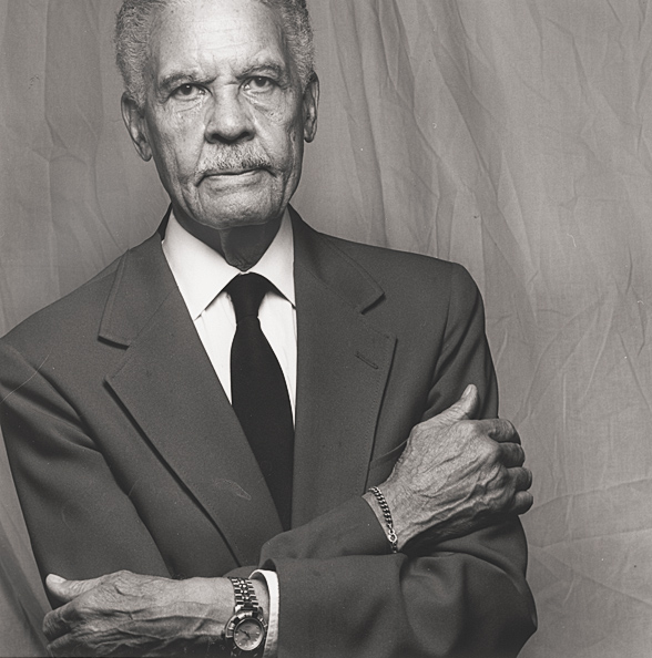
Portrait of General Benjamin O. Davis retired

Portrait of the Commander of the "Red Tails", Benjamin O. Davis , Jr. ©Jarvis Grant

 
Share

February 12, 2012

A Visit to Creative Clay Studios

The Kiln Gods @ Creative Clay Studios

The Gas Kiln Gods @ Creative Clay Studios

This weekend I visited the Creative Clay Studios located in Alexandria, VA with my friend and colleague, Terry deBardelaben. Terry had finished sculpting and bisque firing a rather large vessel and was taking her work to be glazed and fired at Creative Clay Studios. As stated on their web site, “Creative Clay Studios is Northern Virginia’s home for clay artists”. The space allows artists to use the space as they would their own studio while maintaining a larger inventory of all things clay than the average professional artist would be able to keep. Much like an open studio darkroom used to function back in the day. Creative Clay also is a place for artists at all levels, to learn different ceramic techniques and provides  a place of community for the ceramic artist working in the Washington DC metro area.

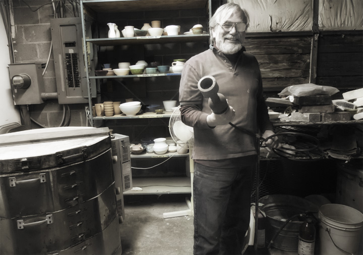
While I was there I met Ed Bull the founder of Creative Clay Studios. Ed loves fire! He is a Ceramic Fireman. While Terry and I were there, Ed was conducting a Valentine’s Couples Workshop. Pretty cool stuff! Couples taking the workshop create separate personal “gifts” for each other or work on a project together.  Anyway, Ed took great joy and pride  explaining how the Studio’s variety of kilns operate. He reminded me of the fact that there’s quite a lot of alchemy involved in the creation of ceramic art. The earth, water, assorted chemistry of color glazes all brought together through the magic elements of fire and timing. I really hadn’t heard that stuff since my days at University as an art student. It was fun to hear again. It was also cool to see Ed interacting with the professional artists that were in the studio. Conferring and interacting with them as colleagues and as Master Craftsman.

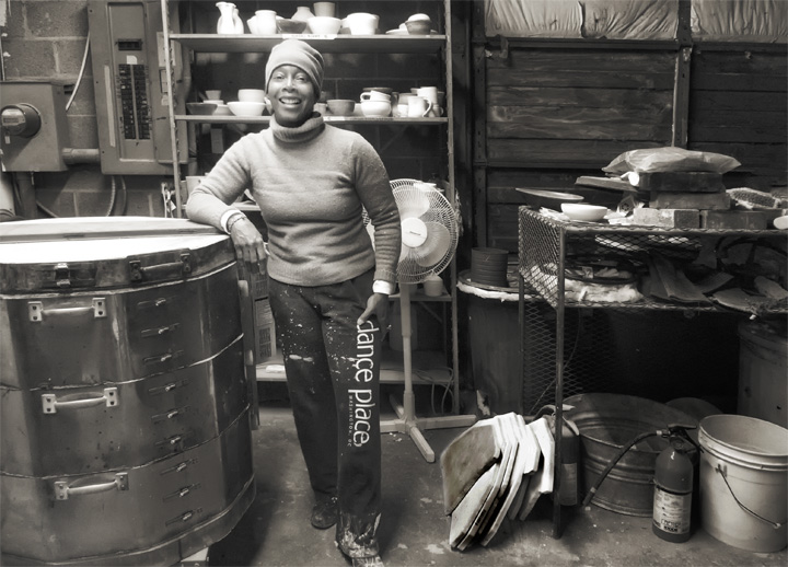
While at Creative Clay with Terry, I used the time to do impromptu documentation of her as she worked on this piece of artwork. I’ve been photographing and videoing her as she’s been working on her many projects. In fact, I was with her earlier that afternoon at her school were she provides Open Studio for her students at the St. Steven and St. Agnes Upper School. I was editing video I shot  at a workshop  she conducted about sustainability and making art. The Creative Clay Studio is a visually engaging  space. When she was finished working I told her I wanted to make a portrait of her in the space. Then Ed came back into the kiln room, and I asked him if I could photograph him too. I belive a got a couple of good environmental portraits of these two artists and I share them now with you.

Terry deBardelaben, Artist/Scholar

Terry deBardelaben, Artist/Scholar @ The Creative Clay Studios. ©Jarvis Grant
Ed-Bull, Artist & Founder of The Creative Clay Studios

Ed Bull, Artist & Fireman, Founder at Creative Clay Studios. ©Jarvis Grant


Slideshow:
Fullscreen:

 
Share

February 5, 2012

Citizens We Community Portrait Project, Continues…

Citizens We Logo

Nancy

Nancy, ©Jarvis Grant

A few month ago, I launch a proposal on USA Projects. I was seeking funding for, Citizens We. At that time I was looking to get $5000 for an upgrade to a new 24 inch Epson printer. Well, I didn’t make my goal and the USA Projects aspect of the project folded. With USA Projects it’s an All or Nothing deal. The odd thing is that while I got nothing from the USA Projects part of it, Citizens We actually began to pick up speed and developed a life of its own. People in the community bought into it, and it started to develop a life of its own.

The strange thing about the “Crowd Funding”  model was that many of the people I actually knew, friends and family,  didn’t support the project. They all wanted to write me a check! But, that’s not how this model works.  With Crowd Funding, you “pledge” an amount to a 3rd party organization. Three folks I knew, my daughter, Maya, and two Howard University classmates, Clarissa Sligh and Dan Wade, along with a former student, which I believe was Chris Belcher (or Chris Smith) bought into the process. The rest were strangers! Now, as disheartening as this was, I came out of the experience feeling pretty good. A colleague  of mine Debra Weiss gave me a call from LA to let me know she believed in the project and would add her support for it to continue. That call was HUGE to my ego and my sense that the Citizens We was an important project to keep pushing forward.

Back in December of 2011 another friend and colleague, Joanne Henson, offered me an opportunity to setup an impromptu studio at her Holiday Craft Bazaar. This afforded me the change to setup the studio, and solicited people to be a part of the project.  Along with making the photographs was doing the paperwork for Citizens We. This would not have been accomplished without the help and encouragement of my friend and now Project Director, Terry deBardelaben. Terry was the one who gave me the idea of a community portrait project, and her support has been my most valuable asset. Photographers like to believe they can do everything by themselves. At least that’s what their PR hype will push forward. But now I see that all artists need someone to manage the details. Or if are not managing those details, to point them out to the photographer/artist,  so their attention and action can be addressed.

Here are a few of the portraits I made at Joanne’s Holiday Craft Bazaar. There are some exciting things happening with the project that I’ll be sharing once we are underway. So for all of you that supported the project when it was on USA Projects thanks so very much! New aspects of the project are proceeding, and I’ll be informing you of the progress. Thanks a lot for your continuing and renewed support for Citizens We.

Slideshow:
Fullscreen:

 
Share

February 1, 2012

New Photography Magazine: The PHOTO Paper

Filed under: Folio,Media,Observations,Photography — Tags: , , , — Jarvo @ 4:54 pm
Cover The PHOTO PAPER

The PHOTO PAPER premire Issue cover

A couple of weeks ago I got an email notice from the Black & White Spider Awards. I was informed that my photographs were being included in the premier issue of a new photography magazine out of London, UK called The PHOTO Paper. This new magazine, “…spotlights the world’s finest photography and shares with its reader intelligent insights from the photographers of the published collections.”  For their premiere issue they’ve showcase a amazing international black & white collection featuring 522 photographers from 46 countries. Hey that’s nice. Glad to be a part of it! The PHOTO Paper comes in two flavors, print edition and digital edition.  The print edition of The PHOTO Paper includes editorial, stories and interviews. The digital issues have more pages and images than the print editions. The digital issues do not include editorial or interviews.

This approach is an interesting one, in that here in the US, there is a publication, Lenswork, that has been around for almost 20 years. With Lenswork, they have the opposite approach with their publication. The print edition is smaller and the digital edition is larger in both “pages” and scope. The digital editions takes advantage of being able to to show Black & White and Color photographs. It also has video and audio interviews. Plus it maintains a an archive of the podcast produced by the publisher Brooks Jensen. The digital edition also comes in a few flavors. There’s an iPad/Pod version, the DVD edition and a newly created online Lenswork digital hub, Daily Lenswork. Brooks Jensen has been able to keep his baby going fired by his passion for photography and the creative process. A few years ago, he made a very brave and bold decision. He took his print magazine off newsstand and offered it only through his Lenswork Virtual Newsstand web site. He was thinking green. Both for the environment and his bank account! In fact the whole Lenswork concept came about in part, to his reaction to the Fine Art Gallery System.  Jensen believed this “System” was not in the best interest of the artist. Lenswork offered an alternative platform of expression for the artist photographer. It also provided an alternative for artist on how to think about how to control their careers. I also feel that Lenswork provided Jensen with the opportunity to make a substantial contribution to the photographic community/industry. Check him and his publication out.

Ok back to me! Well, when I downloaded the PHOTO Paper digital edition pdf, I was very surprised to se that I had a page for one photograph and a double spread for the other. Thanks The PHOTO Paper. What sensitivity and taste you folks have! But seriously, I’m honored to be part of the Photo Paper’s premier issue. Plus a special shout out to the Black & White Spider Awards for making it possible. Thanks guys.


Slideshow:
Fullscreen:


Share

December 20, 2011

The Adobe InDesign Online Cheat Sheet

Filed under: Digital Tech,Education,How-To — Tags: , , — Jarvo @ 12:46 pm

I have found that sometimes the best and fastest way to get to info that I need is to post it on my own blog! Here’s a great resource I found on Terry White’s blog. The Adobe InDesign Cheat Sheets.

Complete List of InDesign Shortcuts

Courtesy of Business Stationery

 
Share

November 26, 2011

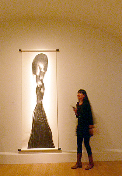
Guest Blogger – Terry deBardelaben: Zhang Chun Hong at National Portrait Gallery

Zhang Hong at the NPG in DC

Zhan Chun Hong at the National Portrait Gallery, ©Terry deBardelaben

I was struck by Zhang Chun Hongs’ presence and what appeared, at the time to be, a woman in “command of her gallery”.  Tall, statuesque, stately, demure, and stunning. Words that I would use to describe Zhang Chun Hong. I happened upon Zhang Chun when she was being physically prepped- surrounded by technicians, for her 2:00PM presentation at the National Portrait Gallery’s Portraiture Now: Asian  American Portraits of Encounter exhibit.

After briefly speaking with the artist before strolling with her to her space I found Jhang to be friendly and very engaging.  She broke the ice by approaching us – Jarvis Grant and I.  At the beginning of her talk she began telling a very classical story of migration and change.  Information about how the artist gave birth to her renown symbolic portraits …streaming charcoal drawings mounted on white scrolls, which give her work a commanding and stately traditional presentation.

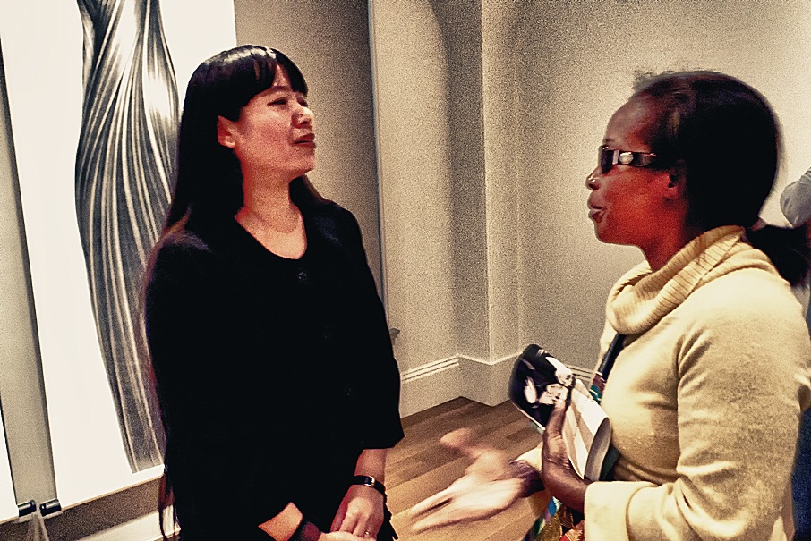
Zhang Chun Hong, Artist with Terry deBardelaben at the National Portrait Gallery

Zhang Chun Hong and Terry deBardelaben at the Smithsonian's National Portrait Gallery. ©Jarvis Grant

Zhang Chun Hong’s work, on the surface, appeared ultra feminine.  After all, hair— every girl’s nightmare, desire, obsession and preoccupation WAS the focal point.  Yet, while I gazed at the striking portraits…I began to think about the bombarding questions provoked by the –black streaming, long flowing meticulously presented hair. But also, I wondered about the artists’ hair-… (Zhang stands approximately six feet tall with hair reaching down to her thighs). The obvious questions pertaining to…hair maintenance, hair care, length of time it takes to grow hair that long, the process associated with washing  and drying extra long hair, etc. etc. And Oh, had she ever considered cutting her hair, do her sisters, mother and aunts have long hair?   I wondered why in some cultures hair is
“ associated with life force, sexual energy, growth, and beauty”.  Why people question the beauty of women with bald or shaven heads?   I found myself wondering whether or not Zhang Chun or Hong Zhang as she is known in the US was attempting to make some sort of feminist statement that went beyond the politics of hair.  Perhaps her motivation was more about the dominance of the physicality of hairs’ impact on culture, gender and tradition.  So-oo, when Hong Zhang began speaking, I hung on to her every utterance.

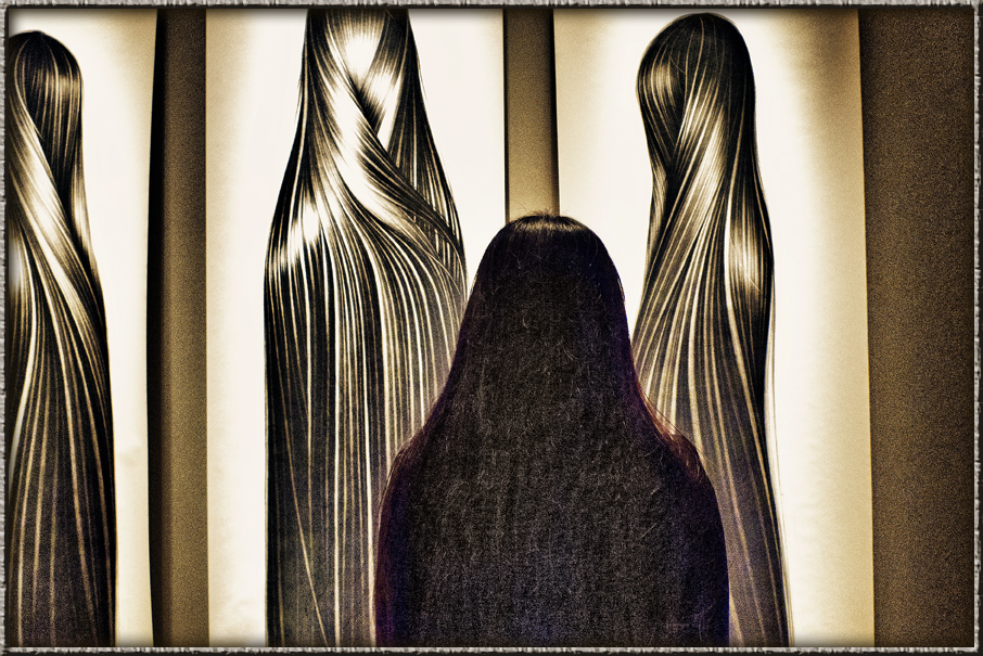
Her autobiographical work, visually communicated her story was yet conveyed in an extremely intimate setting conducive to the confines of the gallery space.  The portraits, wood flooring and small gathering lent itself well to creating an environ that complimented the artists words and story telling allure.  Hong Zhang was humorous- recanting funny vignettes about the impact of language and culture on her life.  She has a very interesting personal history about her artist DNA.  She and her twin were both painters, winners of art competitions and to some measure are predisposed to being artist since both parents are art professors.  Before she arrived in Atlanta from Beijing in 1996 with her twin sister, she attended boarding school. They ate their meals together and spent a considerable amount of time together. She is left-handed and her sister right.  Other boarders were always fascinated by how much they seemed like one person when they sat eating side by side – one using the left hand and the other the right.  It tied in perfectly with her triptych of herself, her twin and the older sister.  Mind you these sculpture like portraits exaggerate the length and flow of the dark illumination of the hair, which at times makes one feel as though they are in the presence of statues.  Statues with their backs turned only allowing the viewer to engage the posterior view of the hair –with the slightest suggestion of a head.  However the unmistakable visual dominance of the composition is the hair…each strand articulated with precise clean lines.

Hong spoke of her East/West triptych having both a Renaissance and Chinese presentation.  In traditional Chinese paintings Jhang said that his advisors always flank the emperor.  In Jhang Chuns’ triptych –her older sister has the center portrait, and like a traditional Chinese painting which depicts the military advisor to the emperors’ left she symbolically presented her hair twisted toward the because she often took on the role as the fighter-protecting and coming to the aid of her twin.

As Hong stood in front of each portrait she transformed the space with warmth and insight about her life.  The behind the scene story of her journey to this country and her constant reference to her work gave those in attendance a brief look at the artist as conveyed through her own lenses.

Terry deBardelaben,
Artist, Educator and Researcher

Jarvis Grant photographing Zhang Hong at the National Portarit Gallery, ©

Jarvis Grant photographing Zhang Hong at the National Portrait Gallery, ©Terry deBardelaben

Zhang Chun Hong, Artist

Zhang Chun Hong, Artist, ©Jarvis Grant

 
Share

October 4, 2011

Photoshop’s Content Aware Fill: The Agony & the Ecstasy

When Adobe’s Photoshop CS5 was introduced, its biggest marketing ploy…uh I mean creative feature was Content Aware Fill. This feature allows you make a selection around some visual annoyance and like magic Photoshop will fill the selection with whatever is around or near the object in question. So if someone should walk in front of you while taking a photo, you can eliminate them using Content Aware Fill. Now in the old days of film, you would simple wait for a clear shot, but that’s so old skool!

So why Agony & Ecstasy? Some of you may remember that 1965 big budget film The Agony & the Ecstasy with Charlton Heston as Michelangelo and Rex Harrison: Pope Julius II. In a nutshell, The Pope wants sculptor Michelangelo to paint the Sistine Chapel ceiling, while Michelangelo wanted to sculpt the Pope’s tomb. So because the Pope had the power, he made a sculptor paint! And on his back 50 feet above the floor! It’s the same old story, corporate demands against designer vision, the marketing department’s messages against the design department’s voice. What’s all this got to do the Content Aware Fill? Adobe’s marketing department pushes feature sets to the weakest or newest users of their flagship product, Photoshop. Pushing fetures that “fix” apposed to features that “create”. This content aware feature is powerful when used as a creative tool. Here’s one way.

In this example, I’ll use Fig.1. Normally, we would use the, Content Aware Fill (CAF), to get rid of some out of place element, like the building to the right. Here I’ll use the couple walking on the sidewalk. First, I’ll use the Quick Selection Tool to select the couple. Just a Note: CAF does not “create” content, it replicates content found near the selection. I choose the walking couple because they were on the grassy plane. I didn’t choose the person in front of the bus top because Photoshop would not be able to Create the missing segments of the bus shop. For best results, after the selection is made go to Select/Modify/Expand and choose about 4-16 pixels. When this is done Photoshop will compare those pixels inside of the selections border with those near the outside of its selection border. It will take that information and guess at what should be on the inside. Once we have the selection hold Shift/F5 to bring up the CAF dialog box (Fig.3), and click OK, and like magic, the couple is gone. Now, there’s always a little Stamp (Clone) Tool cleanup, but 90% of the work is done (Fig.4).

Slideshow:
Fullscreen:
Okay, now when I took this photo, the subject was the sky and those beautiful lush clouds. I wanted the clouds that were near the horizon and didn’t want to lose them by tilting the camera higher. I then suddenly thought of CAF! Get rid of everything except the clouds. This should work great on an organic fractal pattern element like clouds. When I got back to the studio, I tried it and it worked like a charm Fig. #5 – #10. I simply selected the bottom of the image with the Lasso Tool and hit Shift/F5. I thought I was done because I just want some cloud pictures as elements with other photos., so I tried it again. This time I hit Ctrl +J (Cmd+J for Mac) and created a duplicate layer of the original shot. On Layer 1 I did that CAF magic. Now for fun, I made a layer mask (FIG.6) and brought back the person walking on the sidewalk along with their shadow. This looked natural because all the lighting was the same!

This was looking pretty good, but something was missing. The story was almost there, this person walking in the clouds needed a destination or something, so I added a Moon. This planet was made in Photoshop using Flaming Pear’s LunaCell plug-in filter. LunaCell creates instant planets. Fractal, reality-based, or start from scratch to make strange new worlds. I got a couple of atmospheric moon already and just added one using the Blend Mode of Screen.

Slideshow:
Fullscreen:

By thinking of creating an image not fixing a photo, I was able to turn a gorgeous day in Washington, DC, from urban landscape into a Dreamscape. In part with the help and power of Content Aware Fill and a little personal vision.

The Dream Catcher

The final image with all of its new elements in place, ©Jarvis Grant

All images & rights. ©Jarvis Grant

 
Share

September 21, 2011

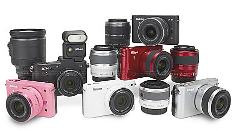
Nikon 1 System: Has Nikon finally got small right?

 Nikon1 Series

The Nikon1 Series Family of Products

Nikon has introduced the Nikon 1  camera system. Not to be out done by Olympus, Panasonic, and Ricoh, Nikon has produced a small sensor, mirrorless, interchangeable lens camera system. These cameras are targeting photography enthusiast who want to actually learn photography and step-up from their point & shoot camera. The system is also trying to woo pro photographers who want a serious camera with interchangeable lens that don’t  weigh a ton and are small & agile.

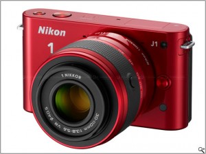
First there’s the Nikon J1. This 10 megapixel camera is design with the photo enthusiast in mind.  It’s got a bunch of pro features, yet its interface is closer to the familiar point & shoot model this photographer may be used to. It also has a couple of “dangerous” features! I consider a feature dangerous when the camera ports to be smarter than the human being using it. One such feature is , Smart Photo Selector. If you’re too dumb to choose which shot is best, the camera will make the selection for you! The subject’s head is down or turned from the lens? Hmmm…that must be a mistake! Let’s (the camera) delete it. Nikon marketing experts say, “With a single touch using Smart Photo Selector there are no more imperfect photos.” Yeah, right. Well, if you want it comes in different colors, like pink, with lenses to match!

Nikon 1 J1

Nikon 1 J1 in Red

Ok, next is the big brother , the Nikon 1 V1. Again this is a 10 megapixel camera with a few extra “pro” features. It has an electronic viewfinder, a hot shoe, Nikon i-TTL flash metering utilizing the Nikon Creative Lighting System, with both an electronic & mechanical shutter with speeds as low as 30 seconds, and the option of adding an external mic when shooting HD video. It looks to be quite interesting. At least on paper. Only comes in black, thank God!

Both cameras have the new Nikon CX sensor. This sensor is smaller that the Nikon DX sensor and the four-thirds senor. Yet, it’s bigger than the normal point & shoot camera sensors. This should up the ante on image quality without packing in a bunch of false megapixel numbers. At least for the time being. Both cameras also shoot HD 1920 X 1080/60i video with a HDMI output, but no HDMI cable in the box. They also come with Nikon’s low end viewer software which can “edit” stills and video. Hey Nikon you could have done a little better here. Like offer Adobe Photoshop/Premier Elements. Or offer a stand alone computer capture module. Oh well!

Nikon V1

Nikon 1 V1 in Basic Black

Still there’s one feature these cameras have that I think is really cool, The Motion Snapshot. With the Motion Snapshot, when you take a picture it captures a tiny video. It reminds of Star Trek Voyager, where they had digital picture frames that had just a little bit of motion to them. Pretty slick!

Nikon CX  Sensor

The orange rectangle is the Nikon CX Sensor

Now, I’m a Nikon shooter. I first real camera was a 1965 Nikon F. I’ve always bought Nikon, until my first point & shoot Nikon. It was a piece of junk. Than I bought a second one a bit higher on the food chain, it was a piece of crap too. Both cameras just simply fell apart From that I said “Never again!”.  My final point & shoot 35mm camera was a Leica Mini-Lux Zoom. Now that was (and still is) a camera! Then I experimented. I bought some Nikon CoolPix for my school (Ellington School of the Arts in DC). Was not impressed. So now, I’m looking for an interchangeable small digital camera and this Nikon1  V1 could be it. But if Nikon has come up with this, Canon can not be far behind. Both Nikon and Canon, who are the traditional Camera Giants, are still playing technology catch-up with, the new kids on the block, Olympus (who’s not that new!), Panasonic, Sony and Ricoh. Hey, things are starting to get interesting!

 
Share

September 14, 2011

Amtrak Northeast Regional: Part 1

Amtrak Northeast Regional Map

My route from Washington, DC Union Station to New Rochelle, NY.

I’ve been traveling on Amtrak since I was in college in the early 1970s. During those days the train only stopped at New York Penn Station. Now Amtrak’s Northeast Regional,  stops a little closer to my hometown of Mt. Vernon, NY at New Rochelle, NY. So, for the past three years I’ve been going up to New York on a more regular bases, about 5 times a year. Checking in on my Mom and my daughter, Maya. Now, Maya grew up in DC, but has recently moved up to New York to live her dream of being an artist and helping her Grandma. She’s really making a go of it and is doing better at it then in DC. I find that interesting because DC is a smaller creative market than New York, and a bit easier to break into. But New York is more progressive and a real art town.

Okay, now during all those years of riding the train, I would a photograph here and there, no big deal. Spent most of the ride sleeping. During the past three years I got a really nice point & shoot digital camera, the Panasonic Lumix LX3.  The camera is small, fast and pocketable with a wide angle f/2.0 Leica zoom lens. This camera allows me to shoot more pictures, about the equivalent of 7 rolls of film, on a two gigabyte memory card. I love it. Very surprised with the images I’ve been producing with during my mini train journeys.  I also carry an extra memory card and battery. That’s almost a brick of film, for those who remember film bricks!

Now a few things have been happening. The first is that I’ve been becoming more familiar with the scenic’s of the trip. Though I’ve become familiar with the views, I’m not familiar  enough to setup and be ready to take a shot. A lot is still hit and miss. A little more miss than hit it turns out! Still I’m learning how to get better shots. After all, I can’t ask the conductor to stop the train or slow it down. So I’ve worked out a methodology for shooting. It goes something like this. I tend to anticipate a photo. As we approach the scene, I’ll ten decide to push the shutter or not. If not and I feel I should have, that composition I missed will go into my mental archive of possibilities. As this archive grows, the potential of making a good shot increases. So I’ll miss “that” shot, but the possibility of something similar appearing again down the track or during another trip increases.

Conductor on the Amtrak Northeast Regional

Conductor on the Amtrak Northeast Regional, leaving New Rochelle, NY on to Boston. ©Jarvis Grant

The next thing that happens when photographing out the window is camera handling. When a stretch of scenery seems promising I turn the camera on so it will be ready to go. Hey the camera is fast, but it’s still a point & shoot. When I firat point the camera out the window, it takes the sensor/light meter about three seconds to adjust to the change of light and become operable, and another 2-3 seconds to focus (if I’m lucky). A lot can pass by in 6 seconds as the train speeds on. I also set the camera to “Burst Mode” so it can keep taking pictures and give be more options of a scene. The downside of Burst Mode, is the camera takes time to process those photos. During that processing time the camera can’t take any new images. Finally, if it’s bright, I put the camera on “Program” so I don’t have to think about exposure and other camera stuff. As it gets darker, I go to Manual Mode or Shutter Priority. More techno thinking and a little less esthetic thinking. Still, it’s all good fun, which is the bottom line along with having new photos.

Within this body of work there are a few thematic series. Below are a few sample images. I’m still working all these images out, sifting and sorting them out. So, in future post, I’ll share what I’ve been doing with these photos as I continue to ride the rails on the Northeast Regional.

Crossing the Bay between Philly and Wilmington

Crossing the Bay between Philly and Wilmington. ©Jarvis Grant


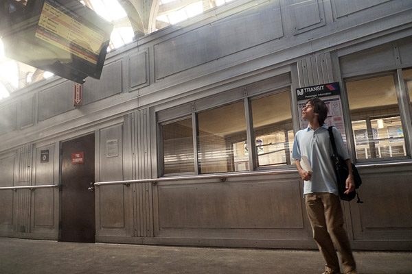
Traveler checking the time board at Newark, NJ Penn Station. ©Jarvis Grant

Traveler checking the time board at Newark, NJ Penn Station. ©Jarvis Grant


New Rochelle Station at Twilight. ©Jarvis Grant

New Rochelle Station at Twilight. ©Jarvis Grant

 
Share

August 22, 2011

Red River Paper Pro: Jarvis Grant

This past week I officially became a Red River Paper Pro. I have been using Red River Paper for about 10 years. It’s a great inkjet paper that comes in many varieties of surfaces, and sizes. I first started using the Premium 37lb Matte in 17×22 sheets and 17 in rolls for projects at the Duke Ellington School of the Arts in Washington DC. As a member of the Museum Studies department faculty, I choose this paper as an alliterative to Epson’s Enhanced Matte paper. First, because it was a lot cheaper than the epson stuff, and then I started to notice that the Red River paper didn’t turn yellow at the same rate that the Epson paper did. Then as papers were getting harder to obtain at local photography dealers, I decided to switch totally to Red River products.

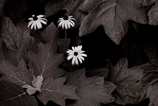
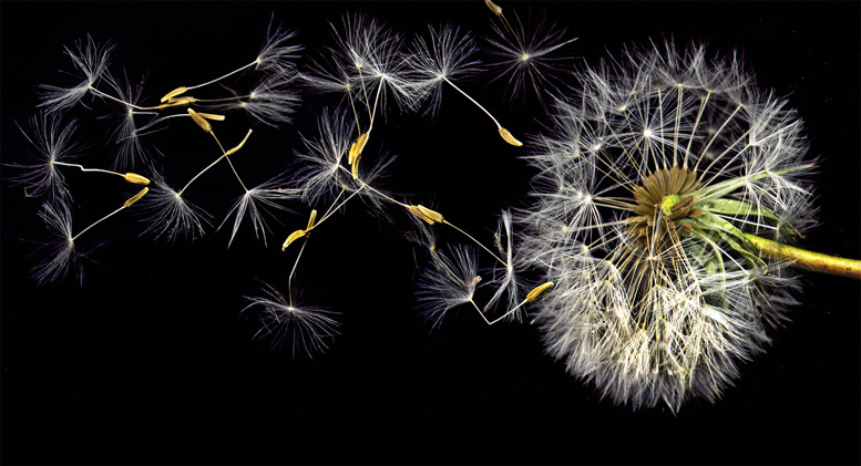
OK back to me! When I saw that Red River had this pro section, I sent them an email to see how to be a member of the club. Drew Hendrix responded and gave me the details of the procedure. I sent the info and samples, and it was a go. I was then put in touch with  the editor, Arthur  Bleich. He made the final selection on the image to be used. He choose the image from the intro of the the Botanical Gallery of my web site. I offered another option, Three Black-eye Susans, but he wanted the image, Blowin’ Flower, because of its “elaborate” lighting and “action”. He was surprised that the dandelion picture wasn’t as elaborate a setup as he thought. I used a scanner to take this action shot!

So, please stop by the Jarvis Grant Red River Pro page and check it out. Thanks!

Three Black Eyed Susans

The image I waoffered as an option, "Three Black Eyed Susans", ©Jarvis Grant


Blowin Flower #4

The images used on my Red River Pro page, Blowin' Flower #4, ©Jarvis Grant

 
Share
« Newer PostsOlder Posts »