Glyphs of Time :: a blog by jarvis grant

May 1, 2012

Composites: Selections, mask and more!

Filed under: Design,Education,Observations,Photoshop — Tags: , , , , — Jarvo @ 4:18 pm
Full Screen Shot

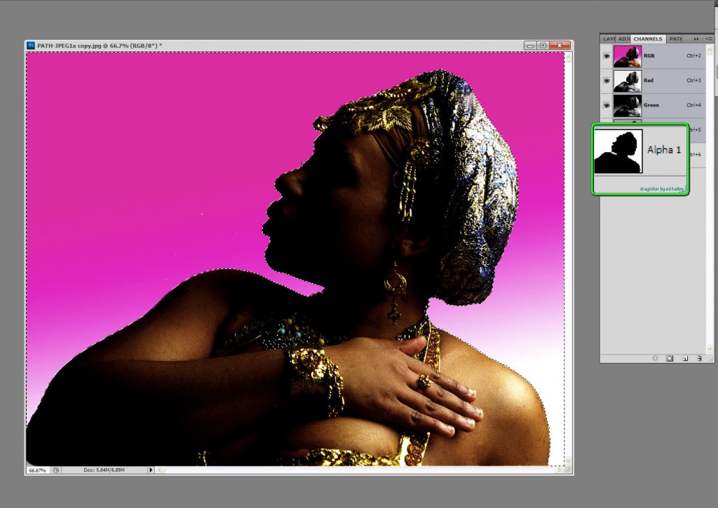
Selections are Alpha Channels that are used in creating Mask. Here is the main figure used in my composite, "Isis". ©Jarvis Grant 2012

Knowing how to make a selection in Photoshop is an artist’s secret weapon. It’s the most important tool/technique that one should master as early as possible. With that said, there is no single “best” ways to create a selection. Everyone has a couple of go to favorites. New students usually start with what Scott Kelby coins as the “Tragic Wand”. Once you understand that there’s more tragic than magic  in that wand, you start to look for options. For many it’s using the Path Tool, which I personally hate! For others it can be the Color Range command. The folks at Adobe know that power and the pain of creating selections and have been developing the Refine Edge command into its on Panel in Photoshop since version CS4. Back in the day, those “marching ants” were at the heart of composting images for designers and illustrators. Yet today there can be more to making a composite than selections.

I’m thinking and writing about this topic because last week I put together  an article on Examiner.com on Saving Selections in JPEG Files. When ever I do an article I first collect the images I’ll use for the article. Then I’ll go through what ever process I’ll be writing about to get the steps clear in my head. First, I wanted to choose an image that I could make a very simple selection with. I had a partial silhouette shot in the studio that would work fine. Went through th steps and made a few screen shots. I was done. The only thing needed now was a new background for the figure to illustrate the new image composite. No big deal, two layers and that will be that. I had a few NASA wallpapers from the Hubble Telescope web site I felt would make a quick and dirty yet fairly interesting image. In fact it turned out to be interesting enough that I seemed to be on a roll! So much so that I began to think about this blog post.
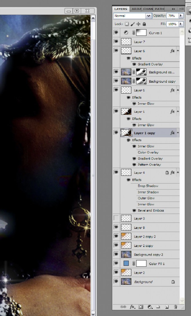
The Layer Panel for Isis

What started just to be two layers turned out to be a few more. ©Jarvis Grant 2012

What started as a simple story with two layers began to grow. Once the main story was invented, I needed to enhance the “mood” of the piece. To achieve this I began to use Blending Modes. The interesting thing was that I was still just using the the main images of the figure and her new background. Using Layer Masks, dupes of the background were now being place on top of the figure, with elements being hidden or accentuated. Portions of the figure were selected and moved to their own layer and painted with Layer Styles. I also had a little help from Flaming Pear and Dover Publications. Well my point here is to not really go into detail of how the new image was made, but to speak to the fact that when “building” a composite it takes more than just ‘marching ants”.

While the final image is a fantasy, as a photographer, I still need elements of reality to bring it altogether. What is the direct and ambient light doing? Along with a healthy dose of trial and error. For example the NASA image though stunning, had a few visual holes into once the two images were placed together. I didn’t want to select stars from the background, because it only had a few, and I waned a little more variety. I found a few “space and star” brushes on the Internet. Through some that “trial & error”, I placed my new “stars” on their on layers and used Gradient Overlay Layer Styles, set to radial mode to give my stars that refraction of color that telescope give to photographs.

This was a simple artistic exercise that also used another secret artistic ingredient, Fun! In having a little fun I learned a few tricks and techniques that will turn up later in future work. Or maybe not! What started out as one thing with one purpose grew into something else. It also shows that even through working with a computer can seem overly technical, in the end, Photoshop is just another tool for artist to use and flow with.

A Dream of Isis

The final composite (so far!), of "A Dream of Isis" ©Jarvis Grant 2012

 
Share

December 20, 2011

Eddie Tapp: Image Rescue Webinar

This webinar is part of x-rite’s educational series of color management webinars. I found that this webinar was extremely informative, and clear approach to understanding how to correct image color problems. This video by Eddie Tapp is about one hour long, but moves quickly. Definitely worth a bookmark.

Webinar: Image Rescue for Problem Files with Eddie Tapp! from X-Rite Photo on Vimeo.

 
Share

October 4, 2011

Photoshop’s Content Aware Fill: The Agony & the Ecstasy

When Adobe’s Photoshop CS5 was introduced, its biggest marketing ploy…uh I mean creative feature was Content Aware Fill. This feature allows you make a selection around some visual annoyance and like magic Photoshop will fill the selection with whatever is around or near the object in question. So if someone should walk in front of you while taking a photo, you can eliminate them using Content Aware Fill. Now in the old days of film, you would simple wait for a clear shot, but that’s so old skool!

So why Agony & Ecstasy? Some of you may remember that 1965 big budget film The Agony & the Ecstasy with Charlton Heston as Michelangelo and Rex Harrison: Pope Julius II. In a nutshell, The Pope wants sculptor Michelangelo to paint the Sistine Chapel ceiling, while Michelangelo wanted to sculpt the Pope’s tomb. So because the Pope had the power, he made a sculptor paint! And on his back 50 feet above the floor! It’s the same old story, corporate demands against designer vision, the marketing department’s messages against the design department’s voice. What’s all this got to do the Content Aware Fill? Adobe’s marketing department pushes feature sets to the weakest or newest users of their flagship product, Photoshop. Pushing fetures that “fix” apposed to features that “create”. This content aware feature is powerful when used as a creative tool. Here’s one way.

In this example, I’ll use Fig.1. Normally, we would use the, Content Aware Fill (CAF), to get rid of some out of place element, like the building to the right. Here I’ll use the couple walking on the sidewalk. First, I’ll use the Quick Selection Tool to select the couple. Just a Note: CAF does not “create” content, it replicates content found near the selection. I choose the walking couple because they were on the grassy plane. I didn’t choose the person in front of the bus top because Photoshop would not be able to Create the missing segments of the bus shop. For best results, after the selection is made go to Select/Modify/Expand and choose about 4-16 pixels. When this is done Photoshop will compare those pixels inside of the selections border with those near the outside of its selection border. It will take that information and guess at what should be on the inside. Once we have the selection hold Shift/F5 to bring up the CAF dialog box (Fig.3), and click OK, and like magic, the couple is gone. Now, there’s always a little Stamp (Clone) Tool cleanup, but 90% of the work is done (Fig.4).

Slideshow:
Fullscreen:
Okay, now when I took this photo, the subject was the sky and those beautiful lush clouds. I wanted the clouds that were near the horizon and didn’t want to lose them by tilting the camera higher. I then suddenly thought of CAF! Get rid of everything except the clouds. This should work great on an organic fractal pattern element like clouds. When I got back to the studio, I tried it and it worked like a charm Fig. #5 – #10. I simply selected the bottom of the image with the Lasso Tool and hit Shift/F5. I thought I was done because I just want some cloud pictures as elements with other photos., so I tried it again. This time I hit Ctrl +J (Cmd+J for Mac) and created a duplicate layer of the original shot. On Layer 1 I did that CAF magic. Now for fun, I made a layer mask (FIG.6) and brought back the person walking on the sidewalk along with their shadow. This looked natural because all the lighting was the same!

This was looking pretty good, but something was missing. The story was almost there, this person walking in the clouds needed a destination or something, so I added a Moon. This planet was made in Photoshop using Flaming Pear’s LunaCell plug-in filter. LunaCell creates instant planets. Fractal, reality-based, or start from scratch to make strange new worlds. I got a couple of atmospheric moon already and just added one using the Blend Mode of Screen.

Slideshow:
Fullscreen:

By thinking of creating an image not fixing a photo, I was able to turn a gorgeous day in Washington, DC, from urban landscape into a Dreamscape. In part with the help and power of Content Aware Fill and a little personal vision.

The Dream Catcher

The final image with all of its new elements in place, ©Jarvis Grant

All images & rights. ©Jarvis Grant

 
Share

January 25, 2011

My New Photoshop for Photographers Class

SAAC Photoshop Class

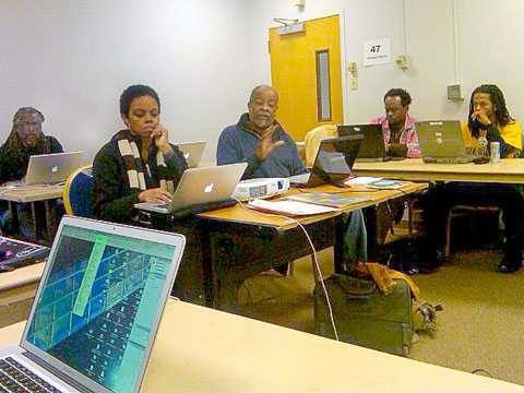
I discuss some of the finer points of Photoshop as Karen Baker works on her images during the class. ©Baba Kuroji Ntu-Patrick

On January 22, I gave my first class through the an organization called, Social Art and Culture, founded by Karen Baker.  The mission of SAAC is a broad yet focused one. It means to, “…encourage design that affects social change. SAAC “Art Activists” will use the power of the performing, visual, music and literary arts to address AIDS, education, housing, health and the environment within disadvantaged communities.”  I think of it as Proactive Arts Education.

Well, Karen had approached me in November of 2010 about teaching a Photoshop class for photographers. I was pretty excited about this opportunity. I have a tendency to try to squeeze in a lot of information into my adult classes, and such was the case with this one. As I had stated in another post, The Occasional Student, adult students really want the information, but you still have to make the information practical and accessible. This class of students ranged from seasoned veterans to people who just bought a camera. There were also designers in the mix, for both web and print.  My goal is to be sure that each student comes away with information that is useful to them and their photography. So, I mixed it up a bit with straight lecture, demo tutorials, and hands on tutorials. What I observed was that, all three worked, but the Demo/Hands-on seems the way to go. That seemed to flush out all issues people had with their computer/software setups. For me it meant getting of my butt and going to students with unique issues. Ah, back in the classroom again!

All in all, it was a great afternoon of fellowship and learning for everybody. Karen, a graphic design and PR pro was right in the mix! Toward the end of the class she announced that she would organize a “Part II” for this class. I wanted the students of go outside to shoot some new images, but at 16°F we opted to  “shoped” and stay indoors!

I’m looking forward to Photoshop for Photographers: Part II this spring.

 
Share

June 28, 2010

Painting in Photoshop CS5

Filed under: Design,Digital Tech,Education,How-To,Photoshop — Tags: , — Jarvo @ 10:23 am

Once again Photoshop CS5 shows itself to be a major upgrade. In this episode of The Complete Picture, Julieanne Kost shows you some of the new painting features in Adobe Photoshop CS5 including the new Natural Media Bristle Tip Brushes.

 
Share

February 20, 2010

Photoshop Startup Dreams Video

Filed under: Art History,Digital Tech,Media,Photoshop,Video — Tags: , — Jarvo @ 2:32 pm

A trip down Photoshop’s Memory Lane, with the Knoll Brothers and a couple of their friends.

 
Share