Glyphs of Time :: a blog by jarvis grant

June 26, 2016

A Little Good News!

Last week a received an email from curator Zoma Wallace of the DC Commission of the Arts and Humanities Art Bank that one of my photographs had been selected to be part of the Commission’s new Washingtonia Collection. It’s always great to sell a piece of artwork. This is especially true now. I’ve had my share of challenges over the past couple of years. So, having the work be chosen as part of a major art collection is a great boost to the ego at just the right time.

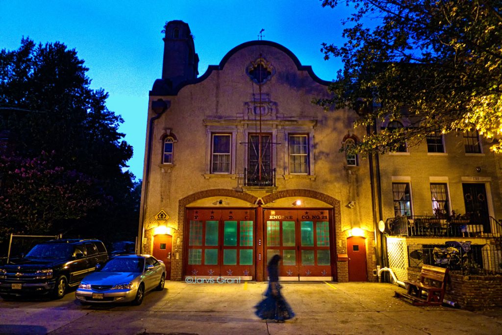
The piece the city will purchase is actually part of my Citizens We project. The photograph, Cinderella of Lanier Heights, is a photograph captured at dusk in my Adams Morgan neighborhood in Northwest Washington, DC. I was photographing the firehouse when a woman in a long and fluffy dress walk into the frame. I’m always drawn to scenes right before the landscape drops into the darkness of night.

So many thanks again to the DC Commission of the arts and Humanities and its panelist for selecting my image.

This image is used in the Citizens We book sponsored by the Humanities Council of Washington, DC

This image, Cinderella of Lanier Heights, is part of my Citizens We book and exhibition project sponsored by the Humanities Council of Washington, DC, and now part of the DC Commission of the Arts Washingtonia Collection.

 
Share

June 19, 2016

New Website Update – New Start

Filed under: Design,Folio — Tags: , , , , , — Jarvo @ 1:00 am

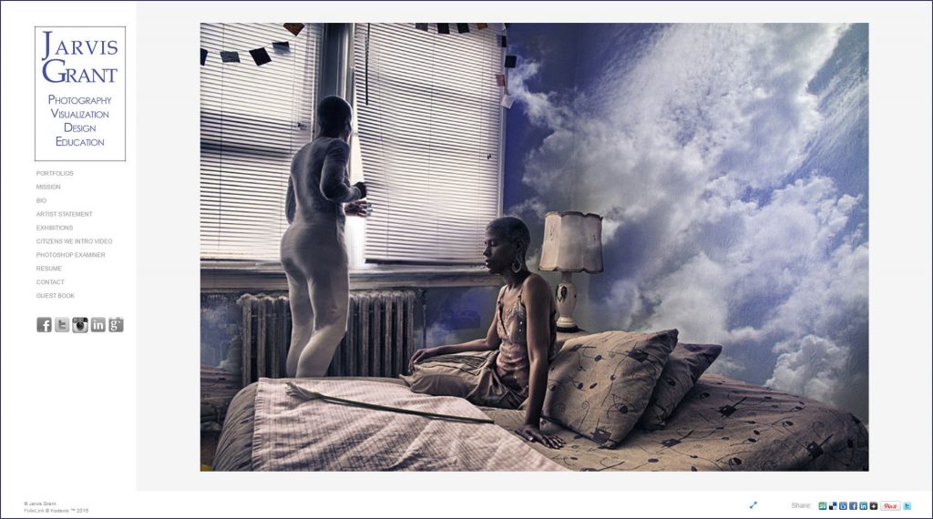
Well it’s been a year or so since my last post. During that time I’ve been focusing on my Examiner.com articles and taking care of my family. The family thing has been huge and challenging.  The Examiner.com thing has been quite rewarding in terms of educational visibility. Yet, the thing that has really been interesting is the update and renewal of my website. I am ashamed to say it, but I haven’t updated my website in six years! That’s really bad. However, as I embark on new artistic adventures I needed my website to reflect all that I am currently doing. While the site was strong enough to show my talent,, Those images and accompanying text had very little to do with what I had been working on during that six year period.

I’m still in the process on updating the site. Working for the site to reflect my move from Jarvis Grant Photographer to Jarvis Grant Creative Strategist. Seems odd, yet makes perfect sense to me. I’ve always mashed up skill set to solve problems. Everything is a design problem. Yes, yes it is!

Jarvis Grant Imaging.

jgwebpage1

 
Share

March 5, 2014

New Year, New Exhibition

Jarvis Grant at Museum Studies Workshop

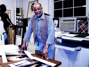
Printing photographs in the Museum Studies workshop space at the Ellington School of the Arts Photo Credit: Marta Reid Stewart

Well, the new year of 2014 started out with a lot happening. One of the major projects I had was to build on the work in my Dream Chamber series. Last year finished with a bang as I completed the first phase of my portrait project, Citizens We. That project began fairly smoothly, and then it seemed to come to a standstill. Then at the end of the summer, funding came through. Now I’m thinking the process will get going but instead a couple of major obstacles began to pop up. Yet, in the end the project took on a new direction and ended very well, with a new outlook and possibilities. Man, what a ride that was.

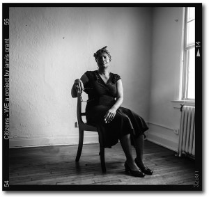
During my last photo session for Citizens We I photographed a neighbor of mine , Daisy Hannah. I used her portrait on the back cover of the book. She had questioned about why I made a black & white image. I gave her a response, but I felt she would like a color version of her image. So I revisited her photographs. Just for fun I decided to work on another shot from our session. I really didn’t do anything with the new image. Pretty straight forward stuff, but then she wanted a set of all the images from the photo shot.  So instead of giving her a set of small JPEG image files, I compiled a PDF slideshow. I thought that would be more useful to her.

When I was done, I thought I’d design a nice artsy cover for the slideshow. Nik Software had just updated the Nik Collection with a new filter, Analog Efex Pro. So, I thought I would do a quick “One Click WOW” while playing with that new filter. It was fun, but I wondered “What would that color image of Daisy look like with a little more work?” During the process I came up with some interesting stuff. But in the end, I thought the image needed more “mystery”. That’s my way of telling myself to start over. In doing so I concentrated on the essentials, Light & Color. Things were going well, but I still needed that mysterious element. I thought of the Dream Chamber images. Do I put a Moon or clouds in the room with Daisy? That didn’t seem right. I wanted an incongruous, yet simple, Earth element. And then, it came to me, Water.

That image was just what I needed to push that series pass the sky elements I had been using. I began to see what the other images of the series could look like. I had an exhibit coming up and I showed the curator Eric Walton, those images in my Bēhance portfolio, and he choose four, for the exhibit, Life Through a Lens, at the Walton Gallery in Petersburg, VA. I really find it amazing that Citizens We portrait project has fed the Dream Chamber series. It should be a fascinating year of image making.

Slideshow:
Fullscreen:


Share

December 2, 2013

Citizens We: A Portrait of Communities

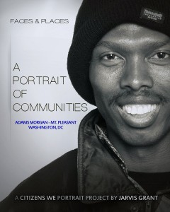
Cover Image for "Citizens We: A Portrait of Communities"

The cover for Citizens We’s first project,
“A Portrait of Communities.
©Jarvis Grant

For the past 18 months I have been working on a community portrait project, Citizens We. At times the progress of the project was looking pretty bleak. Even so, with the help and support of Joanne Henson and Terry deBardelaben the project received funding from the Humanities Council of DC and the DC Commission of the Arts. With the Council funding first phase of the project, a book of forty-two photographs was created, “A Portrait of Communities: Faces & Places”.

Back Cover: Daisy Hannah, Activist  ©Jarvis Grant

Back Cover: Daisy Hannah, Activist
©Jarvis Grant

On December 5, the Humanities Council will host DC’s “Largest Exhibition of Community History and Historic Preservation”.  The Humanities Council of Washington, DC. (HCWDC) proudly presents its’ 7th Annual DC Community Heritage Project (DCCHP) showcase. The showcase will be held Thursday, December 5, from 6:00 – 9:00 pm at the new home of the historic Paul Laurence Dunbar High School, 101 N Street NW, admission is free. The evenings’ program will feature a screening of a film that highlights 18 local history and preservation projects. Attendees will also be able to meet people that led the projects and view the products produced as a result of the DCCHP grant. Remarks will also be delivered by Lionell Thomas, Director of the DC Commission on the Arts & Humanities and David Maloney, Director of the DC Historic Preservation Office.

I am honored that Citizens We is part of this Showcase and want you to attend! Come join us and learn something new about DC’s rich history by registering a http://dcchpshowcase2013.eventbrite.com.  To register by phone, please call 202.387.8391. RSVPSs are strongly encouraged. For further information, visit http://wdchumanities.org.


BuyA Portrait of Communities by Jarvis Grant at Blurb.com


Share

August 5, 2013

New Works and Exhibit

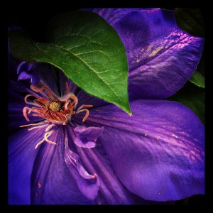
Green Leaf Purple Petal

Green Leaf & Purple Petals, ©Jarvis Grant

Well it certainly has been awhile since my last post. Not to make too many excuses, but I have been pretty busy and I’ll update you about those activities in future posts.

What I’d like to inform you all about now is simply some blatant PR on my part. A colleague and friend, Lew Berry, invited me to participate in an exhibition he was curating at the Friendship Heights Village Center Art Gallery. This is a group show of painters, printmakers, and photographers. I’ve been doing a lot of photography with my phone over the past year, and this was a perfect opportunity to assemble some of this work. It also offered me the chance to make prints from these files. While the camera is 5 megapixels, its sensor is rather small. So it was a challenge making files that look as vibrate as the they appear on the computer’s monitor

This exhibit also afforded me the opportunity to work with a couple of two technologies, MailChimp and a new feature with my portfolio service, Foliolink.  I’ve been working with MailChimp for a couple of years now, and it’s a great email service. I use it to help my clients get the word out about their activities and events. Most of the time they’ll use a “dirty email List”. A dirty list is one with  old email addresses or emails not associated with a person’s name. I had exported my LinkedIn contact into MailChimp, which a very slick feature. All of my email addresses were clean, but I needed to segment these names into categories. The paid membership allows you to do this, but I have the basic free membership, so I had to do this manually. A bit of a drag, but it’s done.

With Foliolink they introduced a new feature, Promo Pages. A Promo Page is like a mini web site you use to promote current projects. I thought this would be a perfect time to announce my exhibit with my social networks. In fact, I’ve embedded  it in this post.  To see it in a scale-able browser window, click here.

So check out my new work. I’m still adding images as I write this. Idf you are in the DMV (District, Maryland, Virginia) area, please stop by the exhibit. Here’s how to get there.

 
Share

February 7, 2013

The 2013 Mobile Photography Awards and Me

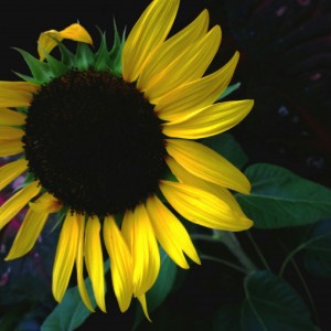
Sunflower #7

Sunflower from the atrium courtyard, National Museum of American Art, ©Jarvis Grant, 2012

In the summer of 2012 I found a new venue of expression, phone camera. As stated in my last blog post, I had always been a camera snob. One reason was I saw so much poor camera phones photography. I have owned phones that had cameras, but never used them beyond visual note taking. When I upgraded to my EVO 4G LTE, with its 8 megapixel camera, the need to investigate its possibilities was very strong.

When I first began using the device, I always had my Panasonic LX-3 with me, and I would “shoot behind” anything I did with the EVO with the LX-3. The Panasonic images were always better in my mind. When reviewing the photos, the reason I felt the LX-3 pictures were better was because I put more into them. So, to really see that the phone’s camera could do, I must not take the LX-3 with me anymore, which forced me to only use the EVO. That was scary at first but necessary if I wanted to learn how to use the new device.

This was good, but I found myself fiddling with the device a lot. My daughter told me about Instagram, and I installed the app. In fact Instagram was the first app I actually installed on the phone, which in itself opened up a whole new word in mobile computing. But that’s another story. Okay, so what Instagram provided was fiddle free photography. While shooting with a square frame took some getting used to again, it was a lot faster than shooting with a twin lens reflex. Then there was the idea of processing the image with Instagram’s filters. They were limited for sure, and I found myself still reviewing the pictures and processing them once I got home. Then one day as I was riding the bus, I was thinking about a couple of images I’d just taken. I took out the phone and began experimenting with the images. It was then I realized I could capture an image, process it and publish it, all while I was out and about. Wow, “mobile photography”! Okay I get it.

Yet, mobile photography was also offering something more. Something I had not felt since my days as an art student and new photographer. Freedom! I regained the freedom to shoot whatever I wanted too and felt like shooting.  As a seasoned photographer I do lot of analytics while making photographs. I was finding that with the phone and all its limitations, I was much lighter, with fewer calculations, rules, and perceived obligations running through my head. When I looked up two months after installing Instagram I had hundreds of new images, with a couple of hundred posted on Instagram. For me, that was very different.

With my newly found mobile photography enthusiasm, I began writing about it in my Examiner.com column, which is the reason for the long gap between blog posts. Plus I entered a few images in the Mobile Photography Awards competition I saw on the Digital Photography Review website. Well last week I discovered in a Tweet from Jack Hollingsworth (@photojack) that the winners of the Mobile Photography Awards had been posted on their website. So I went right over to see if I placed. Well the images I thought were strong in their respective categories were not there. Bummer! When I got to Plants/Flowers category,and saw the stunning first prize wining entry  by Patrick Shourds, I thought, “Oh man, these look great, oh well”! But in the Honorable Mentions group was my entry, Purple Tears, and I was shocked and surprised. Plus I felt pretty damn good.

Here are the other images I entered into competition plus the link to the Mobile Photography Award winners page.

Slideshow:
Fullscreen:


Share

February 1, 2012

New Photography Magazine: The PHOTO Paper

Filed under: Folio,Media,Observations,Photography — Tags: , , , — Jarvo @ 4:54 pm
Cover The PHOTO PAPER

The PHOTO PAPER premire Issue cover

A couple of weeks ago I got an email notice from the Black & White Spider Awards. I was informed that my photographs were being included in the premier issue of a new photography magazine out of London, UK called The PHOTO Paper. This new magazine, “…spotlights the world’s finest photography and shares with its reader intelligent insights from the photographers of the published collections.”  For their premiere issue they’ve showcase a amazing international black & white collection featuring 522 photographers from 46 countries. Hey that’s nice. Glad to be a part of it! The PHOTO Paper comes in two flavors, print edition and digital edition.  The print edition of The PHOTO Paper includes editorial, stories and interviews. The digital issues have more pages and images than the print editions. The digital issues do not include editorial or interviews.

This approach is an interesting one, in that here in the US, there is a publication, Lenswork, that has been around for almost 20 years. With Lenswork, they have the opposite approach with their publication. The print edition is smaller and the digital edition is larger in both “pages” and scope. The digital editions takes advantage of being able to to show Black & White and Color photographs. It also has video and audio interviews. Plus it maintains a an archive of the podcast produced by the publisher Brooks Jensen. The digital edition also comes in a few flavors. There’s an iPad/Pod version, the DVD edition and a newly created online Lenswork digital hub, Daily Lenswork. Brooks Jensen has been able to keep his baby going fired by his passion for photography and the creative process. A few years ago, he made a very brave and bold decision. He took his print magazine off newsstand and offered it only through his Lenswork Virtual Newsstand web site. He was thinking green. Both for the environment and his bank account! In fact the whole Lenswork concept came about in part, to his reaction to the Fine Art Gallery System.  Jensen believed this “System” was not in the best interest of the artist. Lenswork offered an alternative platform of expression for the artist photographer. It also provided an alternative for artist on how to think about how to control their careers. I also feel that Lenswork provided Jensen with the opportunity to make a substantial contribution to the photographic community/industry. Check him and his publication out.

Ok back to me! Well, when I downloaded the PHOTO Paper digital edition pdf, I was very surprised to se that I had a page for one photograph and a double spread for the other. Thanks The PHOTO Paper. What sensitivity and taste you folks have! But seriously, I’m honored to be part of the Photo Paper’s premier issue. Plus a special shout out to the Black & White Spider Awards for making it possible. Thanks guys.


Slideshow:
Fullscreen:


Share

September 14, 2011

Amtrak Northeast Regional: Part 1

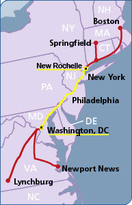
Amtrak Northeast Regional Map

My route from Washington, DC Union Station to New Rochelle, NY.

I’ve been traveling on Amtrak since I was in college in the early 1970s. During those days the train only stopped at New York Penn Station. Now Amtrak’s Northeast Regional,  stops a little closer to my hometown of Mt. Vernon, NY at New Rochelle, NY. So, for the past three years I’ve been going up to New York on a more regular bases, about 5 times a year. Checking in on my Mom and my daughter, Maya. Now, Maya grew up in DC, but has recently moved up to New York to live her dream of being an artist and helping her Grandma. She’s really making a go of it and is doing better at it then in DC. I find that interesting because DC is a smaller creative market than New York, and a bit easier to break into. But New York is more progressive and a real art town.

Okay, now during all those years of riding the train, I would a photograph here and there, no big deal. Spent most of the ride sleeping. During the past three years I got a really nice point & shoot digital camera, the Panasonic Lumix LX3.  The camera is small, fast and pocketable with a wide angle f/2.0 Leica zoom lens. This camera allows me to shoot more pictures, about the equivalent of 7 rolls of film, on a two gigabyte memory card. I love it. Very surprised with the images I’ve been producing with during my mini train journeys.  I also carry an extra memory card and battery. That’s almost a brick of film, for those who remember film bricks!

Now a few things have been happening. The first is that I’ve been becoming more familiar with the scenic’s of the trip. Though I’ve become familiar with the views, I’m not familiar  enough to setup and be ready to take a shot. A lot is still hit and miss. A little more miss than hit it turns out! Still I’m learning how to get better shots. After all, I can’t ask the conductor to stop the train or slow it down. So I’ve worked out a methodology for shooting. It goes something like this. I tend to anticipate a photo. As we approach the scene, I’ll ten decide to push the shutter or not. If not and I feel I should have, that composition I missed will go into my mental archive of possibilities. As this archive grows, the potential of making a good shot increases. So I’ll miss “that” shot, but the possibility of something similar appearing again down the track or during another trip increases.
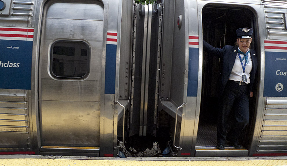
Conductor on the Amtrak Northeast Regional

Conductor on the Amtrak Northeast Regional, leaving New Rochelle, NY on to Boston. ©Jarvis Grant

The next thing that happens when photographing out the window is camera handling. When a stretch of scenery seems promising I turn the camera on so it will be ready to go. Hey the camera is fast, but it’s still a point & shoot. When I firat point the camera out the window, it takes the sensor/light meter about three seconds to adjust to the change of light and become operable, and another 2-3 seconds to focus (if I’m lucky). A lot can pass by in 6 seconds as the train speeds on. I also set the camera to “Burst Mode” so it can keep taking pictures and give be more options of a scene. The downside of Burst Mode, is the camera takes time to process those photos. During that processing time the camera can’t take any new images. Finally, if it’s bright, I put the camera on “Program” so I don’t have to think about exposure and other camera stuff. As it gets darker, I go to Manual Mode or Shutter Priority. More techno thinking and a little less esthetic thinking. Still, it’s all good fun, which is the bottom line along with having new photos.

Within this body of work there are a few thematic series. Below are a few sample images. I’m still working all these images out, sifting and sorting them out. So, in future post, I’ll share what I’ve been doing with these photos as I continue to ride the rails on the Northeast Regional.
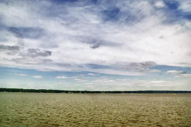
Crossing the Bay between Philly and Wilmington

Crossing the Bay between Philly and Wilmington. ©Jarvis Grant
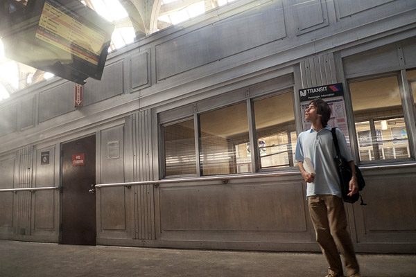
 

Traveler checking the time board at Newark, NJ Penn Station. ©Jarvis Grant
Traveler checking the time board at Newark, NJ Penn Station. ©Jarvis Grant


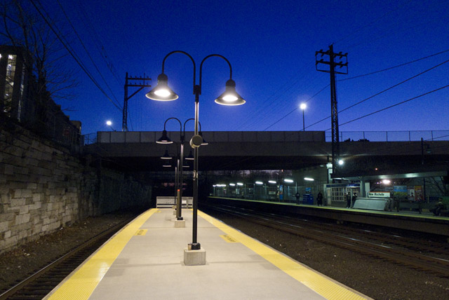
New Rochelle Station at Twilight. ©Jarvis Grant
New Rochelle Station at Twilight. ©Jarvis Grant

 
Share

August 22, 2011

Red River Paper Pro: Jarvis Grant

This past week I officially became a Red River Paper Pro. I have been using Red River Paper for about 10 years. It’s a great inkjet paper that comes in many varieties of surfaces, and sizes. I first started using the Premium 37lb Matte in 17×22 sheets and 17 in rolls for projects at the Duke Ellington School of the Arts in Washington DC. As a member of the Museum Studies department faculty, I choose this paper as an alliterative to Epson’s Enhanced Matte paper. First, because it was a lot cheaper than the epson stuff, and then I started to notice that the Red River paper didn’t turn yellow at the same rate that the Epson paper did. Then as papers were getting harder to obtain at local photography dealers, I decided to switch totally to Red River products.

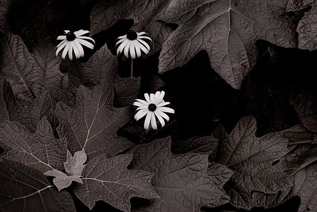
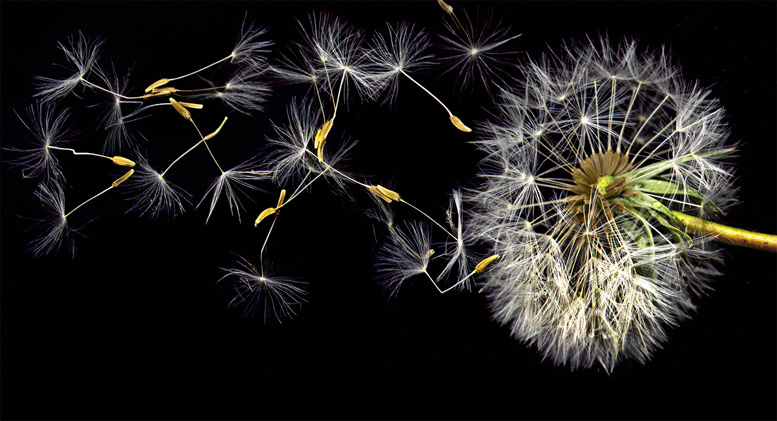
OK back to me! When I saw that Red River had this pro section, I sent them an email to see how to be a member of the club. Drew Hendrix responded and gave me the details of the procedure. I sent the info and samples, and it was a go. I was then put in touch with  the editor, Arthur  Bleich. He made the final selection on the image to be used. He choose the image from the intro of the the Botanical Gallery of my web site. I offered another option, Three Black-eye Susans, but he wanted the image, Blowin’ Flower, because of its “elaborate” lighting and “action”. He was surprised that the dandelion picture wasn’t as elaborate a setup as he thought. I used a scanner to take this action shot!

So, please stop by the Jarvis Grant Red River Pro page and check it out. Thanks!

Three Black Eyed Susans

The image I waoffered as an option, "Three Black Eyed Susans", ©Jarvis Grant


Blowin Flower #4

The images used on my Red River Pro page, Blowin' Flower #4, ©Jarvis Grant

 
Share

August 2, 2011

New Cityscapes, 2011

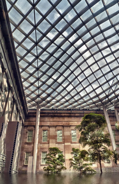
This summer I’ve been going to the Kogod Courtyard at the National Museum of American Art, here in Washington, DC.. I’ve been using it as a “getaway” now that Borders Books & Music is no longer around. The thing I really enjoy about the NMAA is that it stays open until 7:00 PM everyday, so most of the tourist have gone by around 5:00. Since I’m usually leaving around what Jay Maisel calls the Golden Hour or Golden Time. This normally means the there’s a golden color cast from the late afternoon sun. I think of it as that time of day when the sun is low in the sky and cast long shadows. At any rate it’s a nice light.

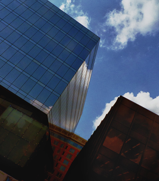
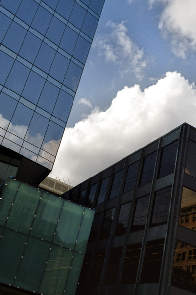
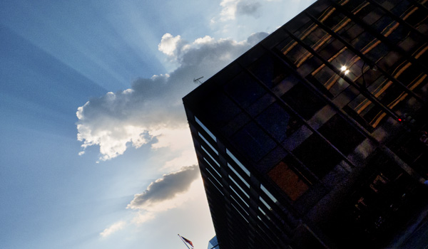
For the last few weeks I’ve been doing some casual shooting in the courtyard and during my walk from the museum to my bus stop. After awhile you start to come up with a series of images. Now I haven’t consciously thought of shooting a series, but since I have a camera with me, I shoot. There’s also some new construction happening on the corner of10th & G Streets NW. This new architecture (new in terms of its presence at the location, not its style) captures my attention in the way the glass walls & corner catch the sky’s light.

I’ve pulled a few of these images and started to play with them.  I’ve also started experimenting with tonal mapping usinf Nik Software, HDR Efex Pro. for my own work, I’m not a big HDR fan. I guess I should really say I’m not a fan of the new classic” HDR look, but in terms of using the technique to dig a little deeper into the highlight and shadow detail of a scene and extending the tonal range, you can get some interesting results. While a can shoot multi exposure bracket with my Panasonic LX3, I can only make three exposures. When I do this I normally make the exposures that cover a range of  2 f/stops. The image from the Kogod Courtyard utilizes this technique. The rest are single exposure that have utilize HDR tone mapping.

So, okay, here are the photos.


Kogod Courtyard at the National Museum of American Art

Taking a little artistic license with the Kogod Courtyard at the National Museum of American Art! ©Jarvis Grant


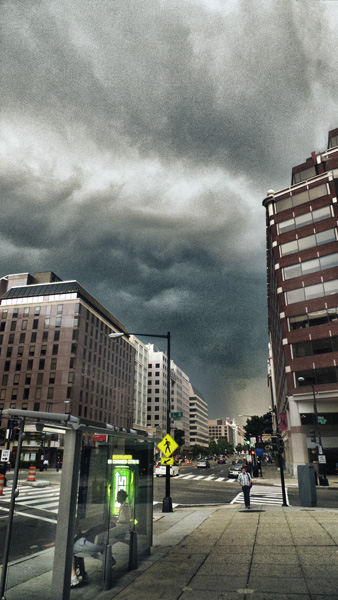
The Coming Storm

A thunderstrom in the distance, from the corner of Conneticut Avenue and L Street NW. ©Jarvis Grant

Shapes, Colors, and Corners

Shapes, colors, and corners on the corner of G and 10th Streets NW. ©Jarvis Grant


Shapes, Colors, and Corners #2

Shapes, colors, and corners, a varation on the theme, ©Jarvis Grant


Granite, Glass, and Sky

The Martin Luther King library at the corner of 9th and G streets NW. ©Jarvis Grant


Share
Older Posts »