Glyphs of Time :: a blog by jarvis grant

August 2, 2011

New Cityscapes, 2011

This summer I’ve been going to the Kogod Courtyard at the National Museum of American Art, here in Washington, DC.. I’ve been using it as a “getaway” now that Borders Books & Music is no longer around. The thing I really enjoy about the NMAA is that it stays open until 7:00 PM everyday, so most of the tourist have gone by around 5:00. Since I’m usually leaving around what Jay Maisel calls the Golden Hour or Golden Time. This normally means the there’s a golden color cast from the late afternoon sun. I think of it as that time of day when the sun is low in the sky and cast long shadows. At any rate it’s a nice light.

For the last few weeks I’ve been doing some casual shooting in the courtyard and during my walk from the museum to my bus stop. After awhile you start to come up with a series of images. Now I haven’t consciously thought of shooting a series, but since I have a camera with me, I shoot. There’s also some new construction happening on the corner of10th & G Streets NW. This new architecture (new in terms of its presence at the location, not its style) captures my attention in the way the glass walls & corner catch the sky’s light.

I’ve pulled a few of these images and started to play with them.  I’ve also started experimenting with tonal mapping usinf Nik Software, HDR Efex Pro. for my own work, I’m not a big HDR fan. I guess I should really say I’m not a fan of the new classic” HDR look, but in terms of using the technique to dig a little deeper into the highlight and shadow detail of a scene and extending the tonal range, you can get some interesting results. While a can shoot multi exposure bracket with my Panasonic LX3, I can only make three exposures. When I do this I normally make the exposures that cover a range of  2 f/stops. The image from the Kogod Courtyard utilizes this technique. The rest are single exposure that have utilize HDR tone mapping.

So, okay, here are the photos.


Kogod Courtyard at the National Museum of American Art

Taking a little artistic license with the Kogod Courtyard at the National Museum of American Art! ©Jarvis Grant
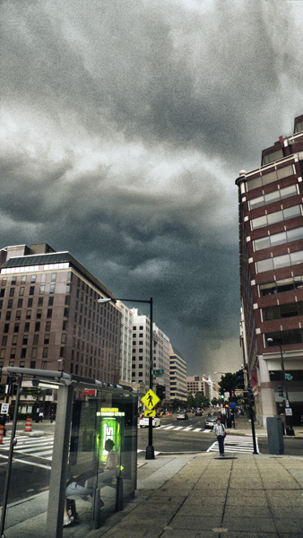
 

The Coming Storm

A thunderstrom in the distance, from the corner of Conneticut Avenue and L Street NW. ©Jarvis Grant
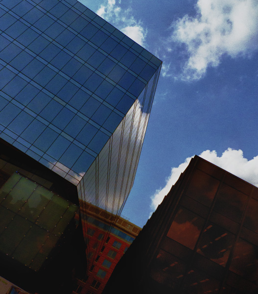
Shapes, Colors, and Corners

Shapes, colors, and corners on the corner of G and 10th Streets NW. ©Jarvis Grant


Shapes, Colors, and Corners #2

Shapes, colors, and corners, a varation on the theme, ©Jarvis Grant
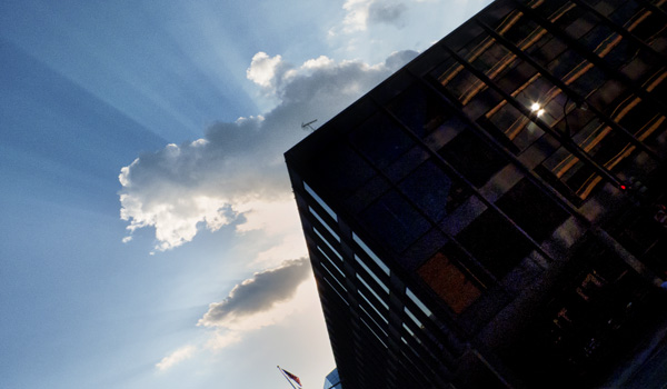
 

Granite, Glass, and Sky

The Martin Luther King library at the corner of 9th and G streets NW. ©Jarvis Grant


Share

July 25, 2011

2011 Black and White Spider Awards

From time to time I Google my name to see what the attempts I’m making with SEO are panning out. Last Friday I decided to check the “Images’ tab just to see what images were coming up. Well, to my surprise I discovered I was nominated for The Black & White Spider Awards. One image was in the Photojournalism Category and the other was for Nature. To be honest, I had forgotten I’d even entered this competition. I do remember that back in May that there was an online Awards Ceremony, but since I hadn’t received any kind of notification, I just looked at it  as an “Oh well, maybe next year” moment. Yet,  I thought I did submit some pretty strong work

Although I didn’t place, it was a great ego booster. While I had two photographs chosen for the exhibit, Sacred Reflections at the Driskell Center on the campus of the University of Maryland, it’s always good to get recognition from your peers about your work. So here are the images I was nominated for, The Amusement Prisoner and A Bed of Leaves.

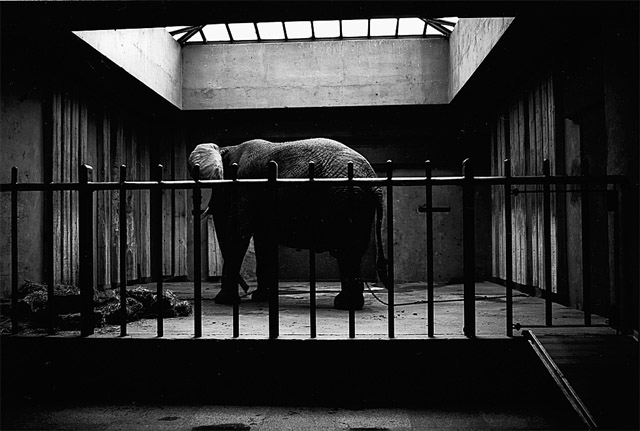
The Amusement Prisoner

"The Amusement Prisoner", nominated in the Professional Photojournalist Category. ©Jarvis Grant

 The Amusement Prisoner was shot on black & white medium format film. I’ve always loved the moody aspect of this image. The scanned negative was brought into Photoshop to do a little tonal mapping for  making new prints on an Epson 4000 printer.

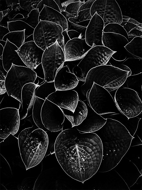
Bed of Leaves

"A Bed of Leaves", nominated in the Professional Nature Category. ©Jarvis Grant

A Bed of Leaves is part of an ongoing series of botanical subject made in the city. It doesn’t make any difference what city as I always have a camera with me. This was a digital RGB file converted to monochrome. Even when I use Nik Software’s Silver Efex Pro, I still go through some type of “Layer Voodoo” to control the depth of tones and space in the image.

I working with some new images now. Well, I should say I’m editing existing work into series now. Getting ready for the fall and winter season’s photo competitions. I’m working hard not to wait until a day or even a week before deadlines to do this work. It’s part of my New Year’s resolution of making  me my most important client. These nominations really help to keep me on point in that regard. Case in point, when I was uploading images for this competition, in true fashion, I waited until the very last minute to upload my stuff, and was locked out of the competitions system after the first two uploads! So I think there’s an important lesson there!

All photographs, ©Jarvis Grant

 
Share

July 16, 2011

Scared Reflections: An Exhibition

Sacred Reflections Announcement
Sacred Reflections at the Driskell Center, University of Maryland

A couple of months ago, I heard a call to artist for the exhibit Sacred Reflection. The theme of this exhibit in the words of its curator Tonya Jordan, “… is inspired by religious and spiritual traditions of the African American community in Prince George’s County (Maryland) and the African Diaspora.” This exhibition features many of the ‘iconic imagery, spiritual verse and biblical references of the Judeo-Christian tradition, Africa’s derived religious practices, and themes metaphysical and esoteric. My works are in that last group, the “metaphysical and esoteric”. While I do believe that the Black Church is an significant element of the African American community, I also believe that the spirituality of an individual transcends the religious dictates of organized religion.

When I saw this call for entry, I thought of several images that I thought would work. Two were already framed and ready to go. These days I’ve got to think of the economics of exhibition photographs. Then there were a couple of images that have been swimming in my head for a while. This call was just the thing to help me flush out them out. Now I usually don’t think in terms of producing work just for a particular exhibit, but since this exhibit was going to be in the David C. Driskell Center at the University of Maryland, I felt it was a great opportunity and venue. Now, I’m not going to get into the technical aspects of these photographs. I’m simply going to present them. In the near future I’ll get into pre and post production of how I created them.

What I found of great interest is that over the course of several years I found myself using the same model, Ava Sheffield. Ava is a great model because she gets into the atmosphere of what I want the subject in the photograph to convey. This makes the image more believable, like an actress on stage. The earlier works were 100 Words and An Ocean’s Song. 100 Words was shot for the cover of the book 100 Words of Wisdom, by Niambi Jarvis. The photograph for An Ocean’s Song was from the same shooting session.  The latest work, Sojourner: The Awakened Dream and The Sojourner’s Quest, comes from the idea of the power of dreams. Or more the power that is found within the dreamer.  Normally I need to live with the work before I start thing of titles for it. At first I was thinking about the subject of the images as a sojourner or temporary resident. While this is very true, after the work was up in the exhibit I began thinking more of the locations she was occupying. So, after this exhibition this series of images will go by the theme title of Dream Chambers instead of The Sojourner. Of these four images I submitted, Tonya selected 100 Words and the Sojourner’s Quest. They always choose 100 Words!  My personal favorite from the submissions was, The Awakened Dream. This reminds me of something my friend and mentor Ed Love once told me. “When you give people the opportunity of choice, they’ll always choose the one you don’t want them to!” Oh well.

Sacred Reflections will be on view at the Driskell Center until August 5, 2011. If you are in the Washington, DC metro area, please stop by and experience this wonderful exhibit.

Slideshow:
Fullscreen:

 
Share

July 9, 2011

Revisiting the Gigapan

A few weeks ago I pulled out my Gigapan EPIC. This is a device developed by Gigapan Systems which allows the creation of large scale gigapixel panoramas. That’s right Gigapixel panoramic images. It does so by stitching together single multi shot megapixel images. I explained this in more detail in my blog post, The Gigapan Pano Portrait. The reason for this renewed interest in my Gigapan EPIC was a project, Nearby Nature Gigablitz, sponsored in part by the Fine Outreach for Science program and  their partners at Carnegie Mellon University’s CREATE Lab. The project asked people who were members of Gigapan.org to make panos of nature that was near where they lived and worked. Since I live in walking distance to the Rock Creek National Park, went down there and setup near the edge of Rock Creek and its Bike Path.

As I shot the “still life” of the landscape I hadn’t any real problem, other than remembering the regiment of using the equipment with my Panasonic LX3. This is my “carry-with-me” camera. The LX3 is a ten megapixel point & shoot with a very nice 24mm wide 2.5x optical zoom LEICA DC F2.0 lens.  So like I said no problems, no worries. But, when I decided to have the Bike/Runner’s Path in the scene, that when I started to have some issues. Since I was by myself, I did the best I could in scouting up and down the path trying to look out for bikers & runners. I was trying to avoid traffic because the Gigapan shoots a series of aligned images that are stitched together. As much as I tried, I always got someone in the scene! Then while swatting away all manner of little flying bugs and sweat, I decided just to shoot very small panos of the Path itself, and figure it all out later.

When I got back and processed the images, converting the RAW files to TIFFs. I first worked in the more classic landscape images. Gigapaners have a tendency to create these great big panoramic images with lots of detail. Creating a very interesting image because you can zoom in and see minute details found with in the scene. That’s what happens when you have a five gigapixel image. My approach was to produce an interesting photograph first.  Light, color, composition, and what Jay Maisel calls “Gesture” are more important than the curious details I’m not even aware at the time of capture. Here are two examples from that shoot. Use the navigation controls to pan and zoom inside of the images. You can also use your mouse wheel to zoom, click & drag to pan.

Okay, now that Bike Path shot. Well I did it! I was able to create a panorama that had a clean clear path in it. To my surprise, I didn’t really like it. I mean it was a good image, but I started to think, maybe having a human element would actually be good. Since I had several “sub-sets”  of the panorama, I began to look at them. To my surprise, there were a couple of good shots in there. I had used a fairly fast shutter speed of 1/400 so the runners & bikers were all frozen in stop action. I had a couple of shots with a guy in a red shirt. With all of the lush green in the images that little spot of red was a great color contrast. Once I had the full “empty path” pano completed, I placed the single frame with the runner in the scene. His tonality was a bit off, so I adjusted his frame to match, but the runner himself, was too dark. So I made another tonal adjustment. He looked great but his frame was now off. To address with issue, I made a  Layer Mask and erased everything in the scene but him. In the words of chef Emeril Lagasse, BAM! It was done. Here’s that panorama.

One of the things I learned from this episode with my Gigapan EPIC is that you can’t let the equipment dictate your creative vision. Now don’t get me wrong, equipment dictates a lot of stuff during a shot. But it’s not the master. I guess all of those little bugs swarming around me (along with the high humidity & temp) helped to break the equipments pull on me. So that during all that the landscape itself had an opportunity to talk with me. Alter all that’s what the whole thing was really about anyway. Capturing a sense of place.

 
Share

June 11, 2011

Epson 4000 Series Printer Maintenance

I have an eight year old Epson Stylus Pro printer. This printer has served me well. I’ve never thought of upgrading because with my Epson 4000, I don’t have to swap out Black ink cartridges for matte or glossy papers. That’s a huge savings! Yet it is an eight year old printer, and I’m starting to notice a couple of issues with this series in general. First, this first series of UltraChrome printers are starting to reach their EOS (End of Service). Epson has upgraded their professional large format printers four times since the 4000/7600/9600/9600 series. So parts, and ink carts are starting to become less available. Second, these printer are simply wearing out. A colleague of mine just had their Epson 10000 44 inch printer “die”. So replacing that printer will be a big but worthwhile investment.

However, for me, I’m not ready to invest in another piece of equipment if I don’t have to! I’ve feel I’ve always done a pretty good job of maintaining my Epson 4000. I’ve kept its software updated, in particular its Maintenance Utility software. Still,  eight years of operation is also eight years of grime that the printer has produced. I’ve always been a little faint of heart when it comes to opening that sucker up and cleaning it out. But thanks to the Epson 4000 Yahoo Group, I ran across this great video on how to clean the Epson 4000/4800/4880/4900/3800 printers. The video comes courtesy of Condé Systems, Inc. This video shows in extremely clear terms the procedure of how to clean the most important parts of the Epson 4000 series printer inner workings. By adding this procedure to my maintenance regiment, I’ll be able to add a few more years to my trustworthy Epson 4000.

 
Share

June 4, 2011

Introducing: The Periodic Table of SEO Ranking Factors

Filed under: Design,Digital Tech,How-To,Media,Observations — Tags: , , — Jarvo @ 1:10 pm

This is a great way of understanding SEO without someone trying to sell you anything! Click on the image and go the Search Engine Land. There you can get the full guide as a PDF.
Search Engine Land Periodic Table of SEO Ranking Factors

 
Share

May 18, 2011

Technology vs. Marketing

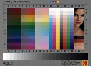
KODAK-Q-60-Color

The KODAK-Q-60-Color Standard

The other afternoon, I watched a webinar from a company I respect a lot, but won’t mention here. They have developed a new “technology” of color management. This technology is software based, and does a really amazing job of creating a complete and cohesive workflow of managing color from initial capture to final output. Now what I found interesting about this hour long webinar was it spent roughly 30-35 minutes marketing the product. It disguised or maybe cloaked this market hype in techno-babel. This techno-babel was used to give the audience “background” on the importance of color management. Okay. I guess?

My problem with the introduction was that, this technology was touted as a professional level tool. If that’s the case, then everybody tuning in knows that color management is. Right? OK, so after the intro, the software & its hardware components were explained, again. We were about 40 minutes into the webinar and the presenter ask moderator if there were any questions. The collective question was, What is the “best” or most practical way to operate the software and its hardware components? So, after 40 plus minutes of presentation the main question is, “How ya use the thing?” And why is that? Because the presenter used 35 minutes selling the damn thing!

This is my main concern with “Technology”. The company’s marketing department gets their hands on the concept and dumb it down to bullet points for PowerPoint presentations. Then they’ll express the concept’s innovation as price points. So, in the case of this webinar, the beauty of this software wasn’t made clear until the last 15 minutes of the presentation. And if not for the collective “What?” from the audience, it may have never come to light. As an educator for over 30 years, I believe the presenter could have been of better service to his audience by telling or teaching them why this equipment better serves their color management workflow. Yet this is the trend when speaking to photographers about anything “digital” or “high tech”. Toss them a bunch of tech-babel at a high enough price tag and they’ll bite. Why? Because if the concept is just barely comprehensible and cost enough it must be good. Thus placing one on the road to fame and fortune! Oh well.

I learned a long time ago that there’s a difference between technology and instrumentation. Technology is the concept or system behind an activity. Instrumentation is the tool for producing the results of that system. The technology of photography hasn’t changed much since 1840. The instrumentation and equipment on the other hand has. The aesthetics of photography and art in general are constantly in flux, yet the principles of design still hold true, for the most part.

So, what about the technology of color management and why one needs it? I think Andrew Rodney, gave a great example of it a few years ago at Photoshop World. He stated that color management is; “The ability to accurately and predictably control the reproduction of images from beginning to end of the imaging pipeline.” Color management is not, “Fixing bad color, especially bad originals.” The technology fixing incorrect color is Color Correction. Color management will ensure that “…even ugly color will be faithfully reproduced.”  So, the old adage still remains true, GIGO – Garbage In – Garbage Out.

So again, technology is a system or concept, not an instrument. I feel the presenter and the company could have explained their product without all the marketing hoopla.  If they would have done that the innovation of their product would have really shined. Here’s a very visual example of the technology of color management, and why you can’t trust your eyes alone to “manage” color. ©Edward H. Adelson

Slideshow:
Fullscreen:

 
Share

February 10, 2011

The Fujifilm FinePix X100: Back to the Future

The Fujifilms FinePix X100 Camera

Is the X100 the shape of things to come?

I think that the professional digital photography industry is starting to settle down. In the beginning just being able to capture an image was amazing stuff. Back in 1991, the first Kodak cameras the DCS 100, were mangled Nikon F3 bodies attached to a humongous contraption were all of its computer components lived.

Kodak DCS 420 body

The 1994 Kodak DCS 420 was a lot of camera for 1.2 megapixels!

Quite a monster, considering it was 1.2 megapixels! Since that time the DSLR has evolved into a tool of more manageable size, speed, and power. The typical pro DSLR body is a grand configuration of buttons and wheels, digital readouts of text, numbers, graphs, and images. While it looks kinda like a camera, I’m still reminded of seeing Dean Collins give a presentation at Photo Expo East in the mid 90’s. He had a “high-end” Foveon digital camera which looked like a laptop with a lens on it. Hey, in essence, that’s what a digital camera is , a computer attached to a lens.

This year Fujifilm has announced a camera that has shaken things up a bit. They have introduced a camera with mechanical parts. A camera with a shutter speed dial on the body, and an f/stop ring on the lens. It looks like a rangefinder, but it’s not. It looks expensive, but it’s not, relative speaking that is. It is the FinePix X100. It actually reminds me of my very first camera, the Petri Racer, but looks more like a Leica M3. Leica also as a mechanical looking camera that’s less than $2000, the Leica X1. The X1 doesn’t have its f/stops on the lens, but on a dial on the body. The X1 is a good looking camera, very sleek. It maintains its heritage and looks much like the camera Oskar Barnack created back in 1914 and introduced to the public in 1925 Still the X100 has got its “retro” down.

I received an email today from Fujifilm releasing the first “official” sample images created by the X100. As usual these aren’t great pieces of photographic art, but they do show off the technical aspects of this 12 megapixel camera. I won’t bore you with the technical specs, you can check out the preview of the camera at Digital Photo Review. The thing that excites me about this camera is that, well, it’s a camera. I love cameras and their gadgets. The X100 takes me back to that time were the magic of photography had embraced me. I time were all I needed to know was shown to me at a glance without having to turn the camera on. Yet the X100 will give you that warm fuzzy feeling plus all of the techno stuff one feels they must have with a modern camera.

This was a bold, brave move on the part of Fujifilm. They know there are photographers out there who know what they’re doing. And by that I mean photographers who love making images, or maybe I should say , love taking shots! Great shots with a minimal equipment complement. This camera doesn’t seem as “pocketable” like my Panasonic LX3, but it has a bigger APS-C CMOS sensor. I don’t any other compact camera has a sensor as big except for the Leica X, that is not a 4/3 camera, which is smaller than the APS sensor. So it’s closer to my Nikon D200 DSLR with out the bulk. A good “take everywhere” camera. I hope that this will be a new trend for camera manufactures, making small “serious” cameras.

Slideshow:
Fullscreen:

 
Share

January 25, 2011

My New Photoshop for Photographers Class

SAAC Photoshop Class

I discuss some of the finer points of Photoshop as Karen Baker works on her images during the class. ©Baba Kuroji Ntu-Patrick

On January 22, I gave my first class through the an organization called, Social Art and Culture, founded by Karen Baker.  The mission of SAAC is a broad yet focused one. It means to, “…encourage design that affects social change. SAAC “Art Activists” will use the power of the performing, visual, music and literary arts to address AIDS, education, housing, health and the environment within disadvantaged communities.”  I think of it as Proactive Arts Education.

Well, Karen had approached me in November of 2010 about teaching a Photoshop class for photographers. I was pretty excited about this opportunity. I have a tendency to try to squeeze in a lot of information into my adult classes, and such was the case with this one. As I had stated in another post, The Occasional Student, adult students really want the information, but you still have to make the information practical and accessible. This class of students ranged from seasoned veterans to people who just bought a camera. There were also designers in the mix, for both web and print.  My goal is to be sure that each student comes away with information that is useful to them and their photography. So, I mixed it up a bit with straight lecture, demo tutorials, and hands on tutorials. What I observed was that, all three worked, but the Demo/Hands-on seems the way to go. That seemed to flush out all issues people had with their computer/software setups. For me it meant getting of my butt and going to students with unique issues. Ah, back in the classroom again!

All in all, it was a great afternoon of fellowship and learning for everybody. Karen, a graphic design and PR pro was right in the mix! Toward the end of the class she announced that she would organize a “Part II” for this class. I wanted the students of go outside to shoot some new images, but at 16°F we opted to  “shoped” and stay indoors!

I’m looking forward to Photoshop for Photographers: Part II this spring.

 
Share

January 13, 2011

2011 New Year’s Night Queen

Filed under: Gallery,Observations,Photography — Tags: , , , — Jarvo @ 1:59 am

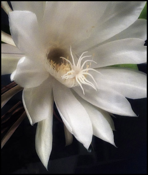
Night Bloomimg CereusOn New Year’s Eve, I wasn’t exactly surprised to see that around 9:00PM, my Night Blooming Cereus was starting to open up. From the first sighting of the bud to the final bloom, takes about 10 days.  I always know when it’s blooming, not by sight but by smell. The Cereus has a distinctive mild, sweet, aroma. I have always had the belief that my Cereus bloomed at special occasions. Sometimes these occasions are happy and sometimes not. Yet, the Cereus’ flower presents itself at some magical interface. So I look for 2011 being a magical positive year!

These photos were made with my Panasonic LX3. This camera has an incredible macro mode. It’s small and light enough to hand hold in awkward positions. Plus its superb Leica lens is a beautiful piece of glass. yet to make these images I had to use an ISO of 800. I wanted to use a somewhat fast shutter speed to minimize blur and an f/stop that wasn’t wide open. The noise was lowered using Nik Software Define 2.0.

Roy Tanck‘s Flickr Widget requires Flash Player 9 or better.

Get this widget at roytanck.com


Click on an image to view it larger.

 
Share
« Newer PostsOlder Posts »